Project goal
This case study explores redesigning an outdated website with a high bounce rate, aiming to create a modern, user-centric experience that enhances engagement. The project involved reimagining the homepage and one subpage, targeting startups and scaleups in the Blue Tech sector. The redesign prioritized usability, visual appeal, and alignment with existing brand elements, ensuring a cohesive and impactful result.
Research process
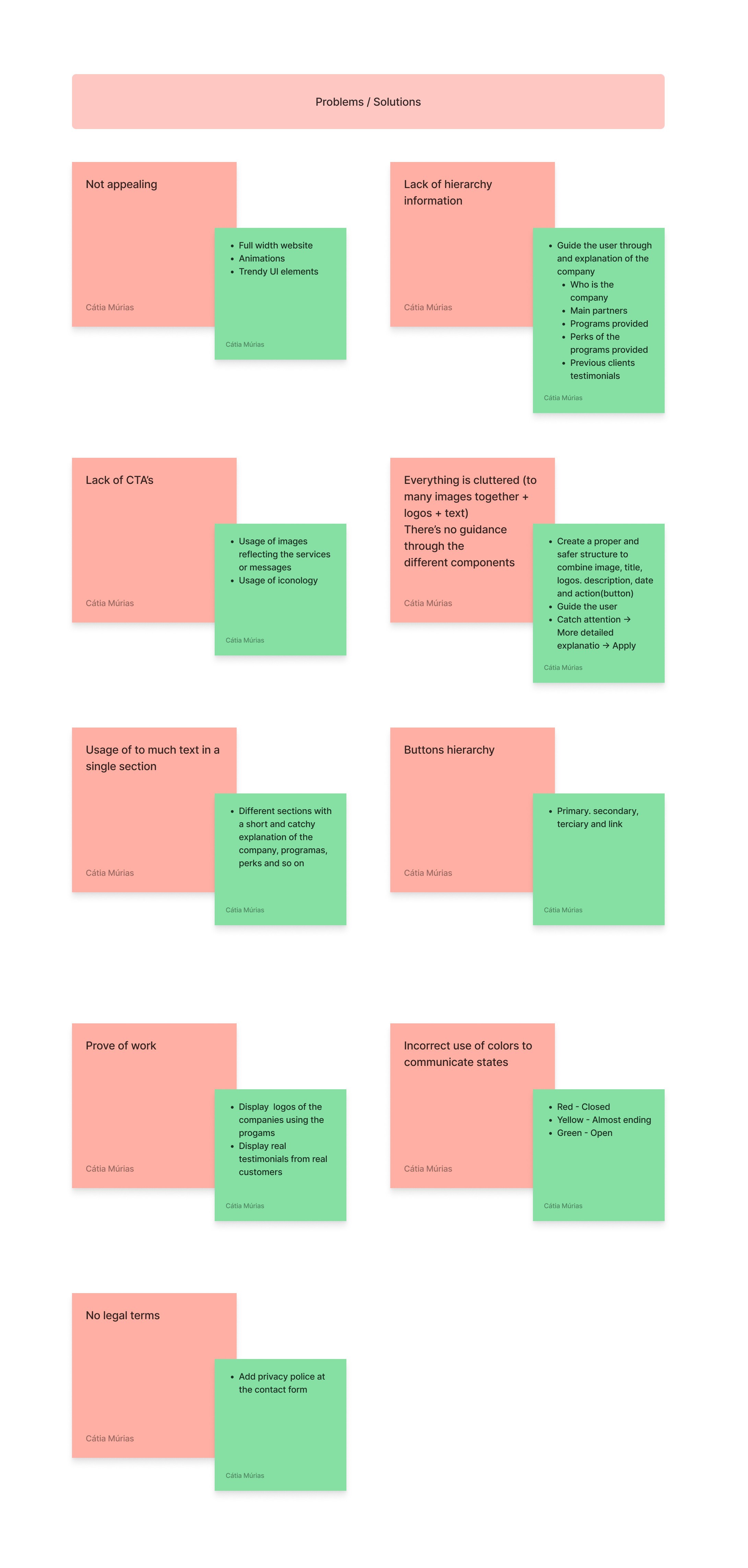
The research phase was focused on understanding user pain points and identifying opportunities for improvement. Through methods like user interviews and competitive analysis, I gathered insights into the challenges faced by the target audience. This process helped uncover critical issues, such as unclear navigation and outdated design elements and informed the strategic direction of the redesign.
Homepage
Subpage

Problem
The website’s outdated design and unclear navigation led to a high bounce rate and poor user engagement. It struggled to resonate with its target audience while lacking a modern, cohesive visual identity.
Solution
The redesign should introduce a modern, user-friendly interface with streamlined navigation and a refreshed visual style. Restructuring the website will improve usability, engagement and create a more professional digital presence.
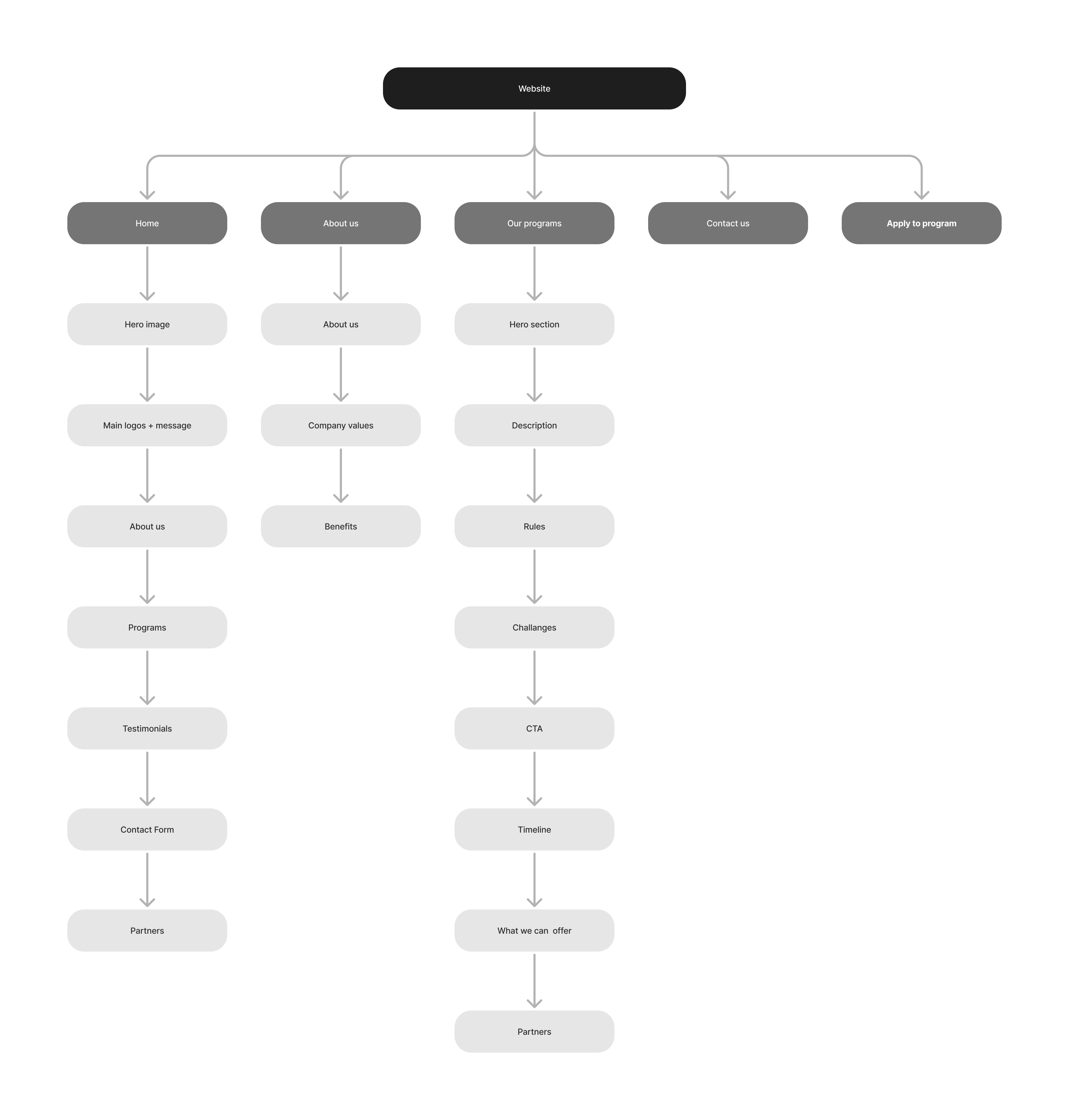
Information Architecture (IA)
The IA established a clear, intuitive structure, making navigation seamless and content easy to access. It served as the foundation for the redesign, ensuring pages were user-focused and well-organized and ultimately enhancing usability and the user experience.
Design System
The design system was developed to ensure consistency, scalability, and efficiency across the website. By defining reusable components, typography, color palettes, and layout guidelines, the system created a cohesive visual identity while streamlining the design process.


Colors
The color palette reflects the brand’s identity, ensuring accessibility and guiding user attention. It creates a cohesive, professional, and visually engaging experience across the website.
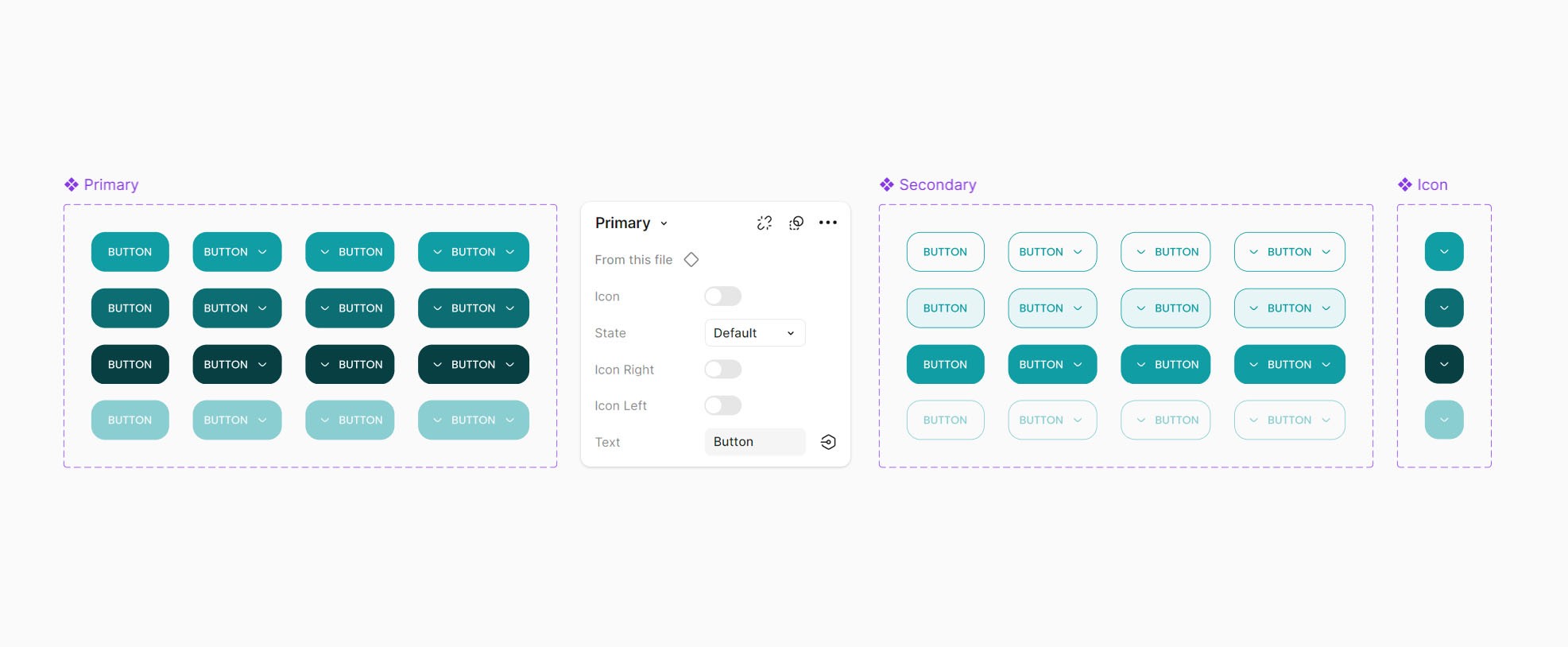
Buttons

Homepage
Description